Modulo: Sustainable Furniture E-Commerce
Designing a luxury online shopping experience rooted in sustainability.
Role: UX/UI Designer
Timeline: 2 Weeks
Tools: Figma, FigJam
Focus: Research, UX Design, UI System
Problem:
As sustainability becomes a priority in modern living, many shoppers want furniture that’s both eco-conscious and beautifully designed. However, current furniture e-commerce experiences often overwhelm users with too many options, unclear sustainability claims, and inconsistent product information.
Through research, I found that users were struggling to feel confident buying sustainable furniture online — they couldn’t visualize how pieces would fit in their space, trust brand claims, or navigate cluttered layouts.
Goal:
To design a seamless, trustworthy shopping experience for Modulo, a sustainable luxury furniture brand. The goal was to make sustainability feel premium and accessible — helping users browse with ease, understand material transparency, and complete purchases confidently
Research
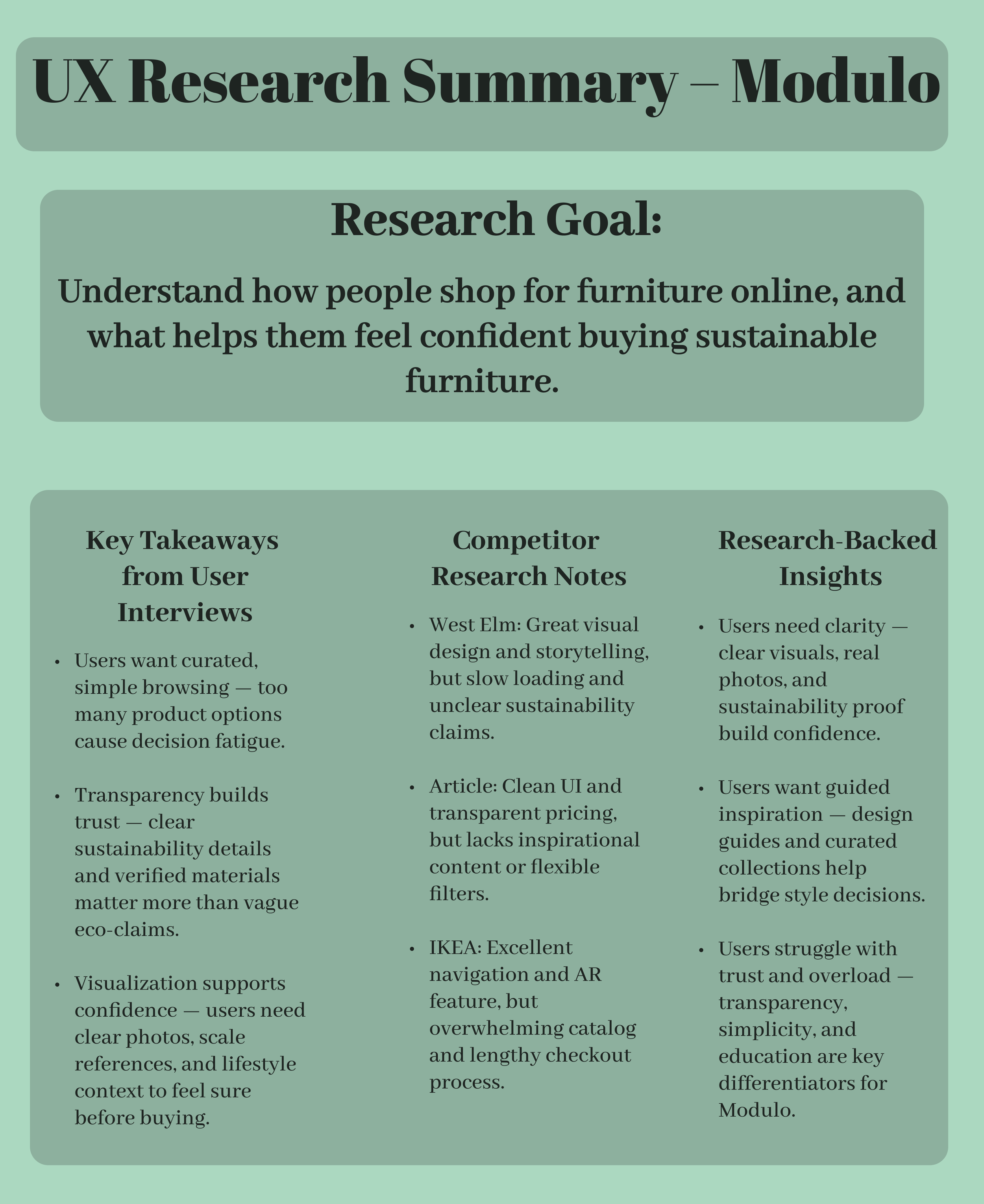
I began with three user interviews to understand how people shop for furniture online:
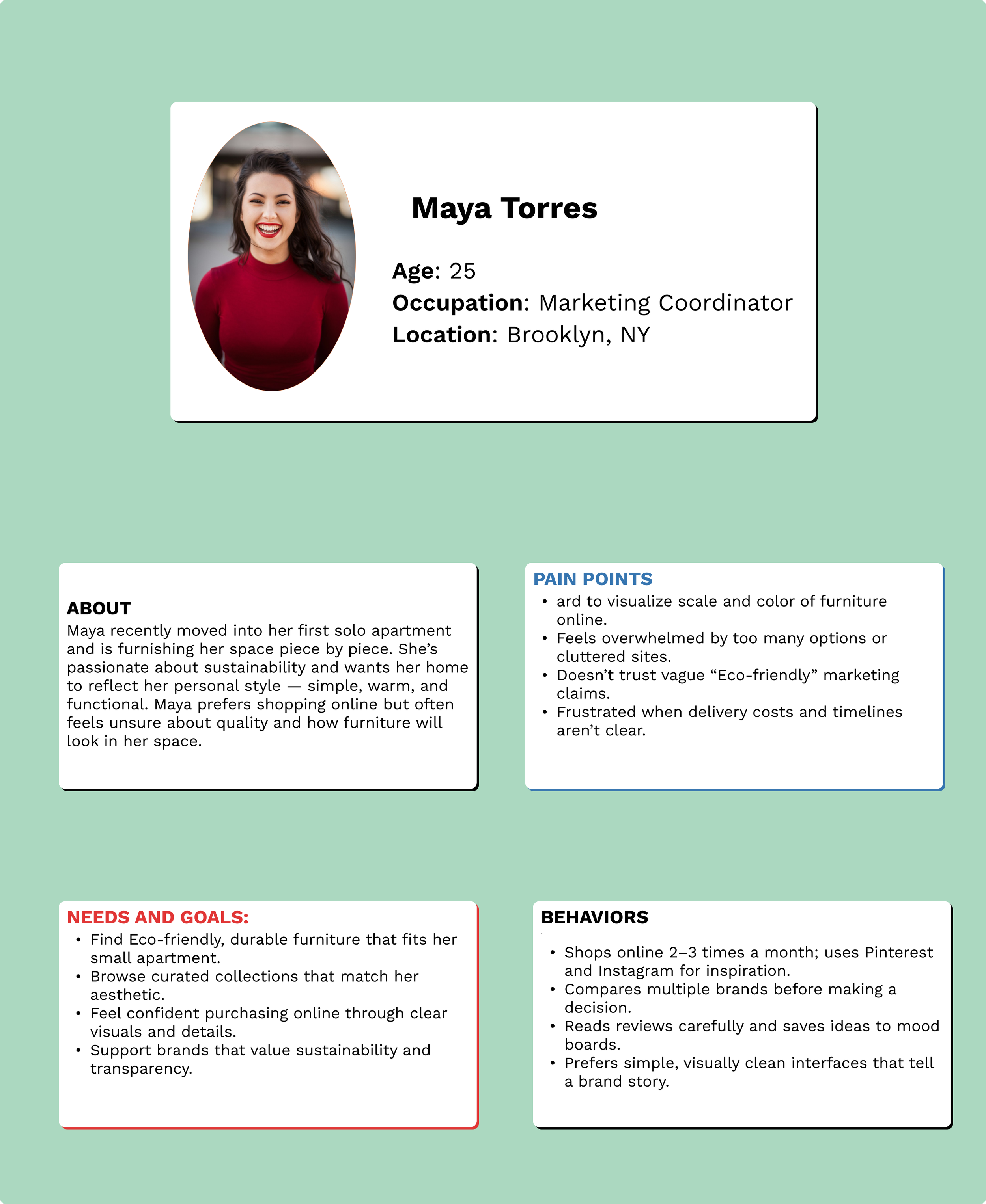
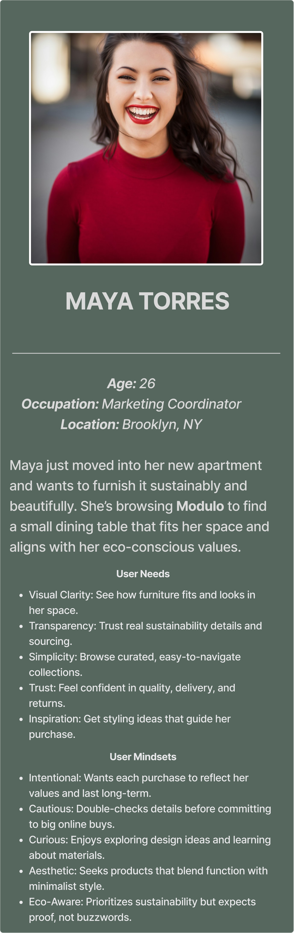
Maya (26, conscious renter): Wanted curated selections and clear sustainability details.
Jordan (34, new homeowner): Needed transparency and assurance before purchasing.
Lila (29, interior designer): Valued aesthetics and storytelling in brand identity.
Across all interviews, users shared five recurring needs:
Visual clarity and scale reference
Transparency around sustainability
Simplified browsing and filters
Trustworthy policies and visuals
Design inspiration tied to products
I also conducted competitive analysis on West Elm, Article, and IKEA to identify what works and what doesn’t:
West Elm: Great visuals but vague eco claims
Article: Clean, transparent pricing but limited inspiration
IKEA: Strong AR and navigation, but overwhelming catalog
These findings shaped my design strategy: create a minimal, guided shopping flow with transparent sustainability cues and integrated inspiration content.
Design Decisions
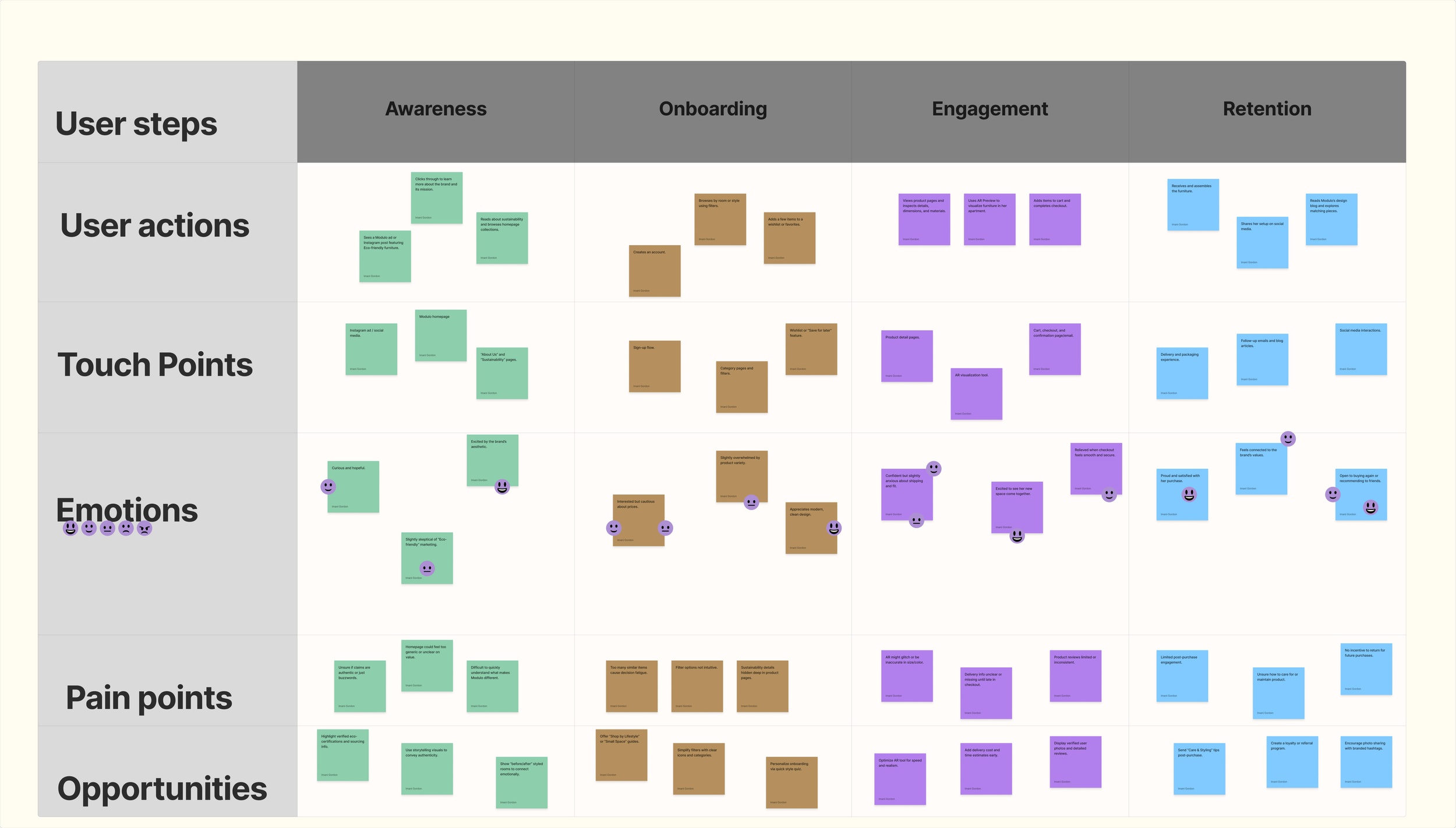
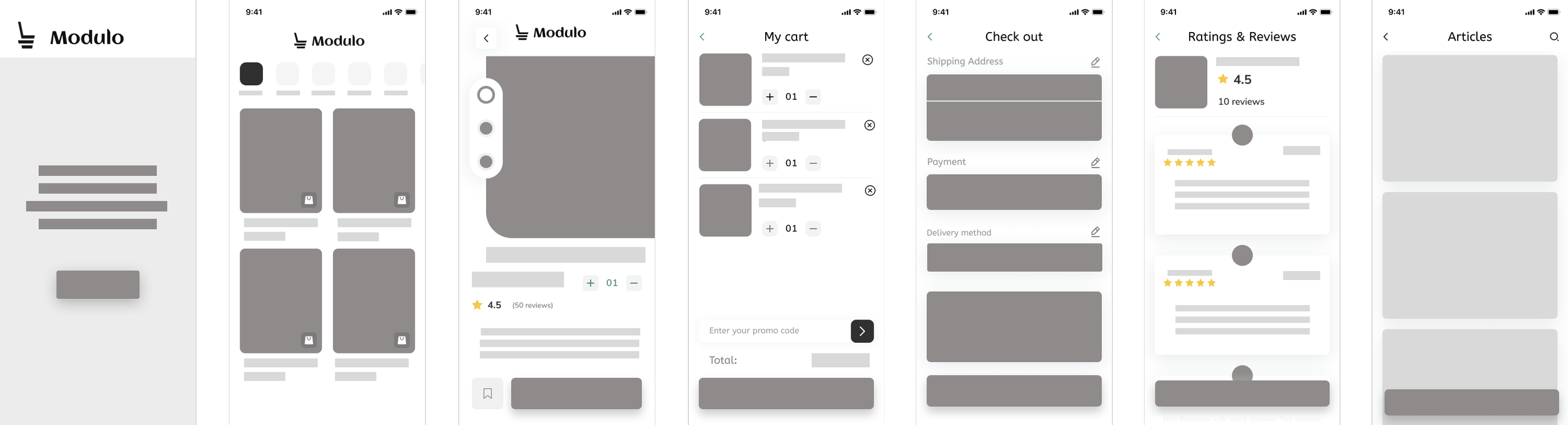
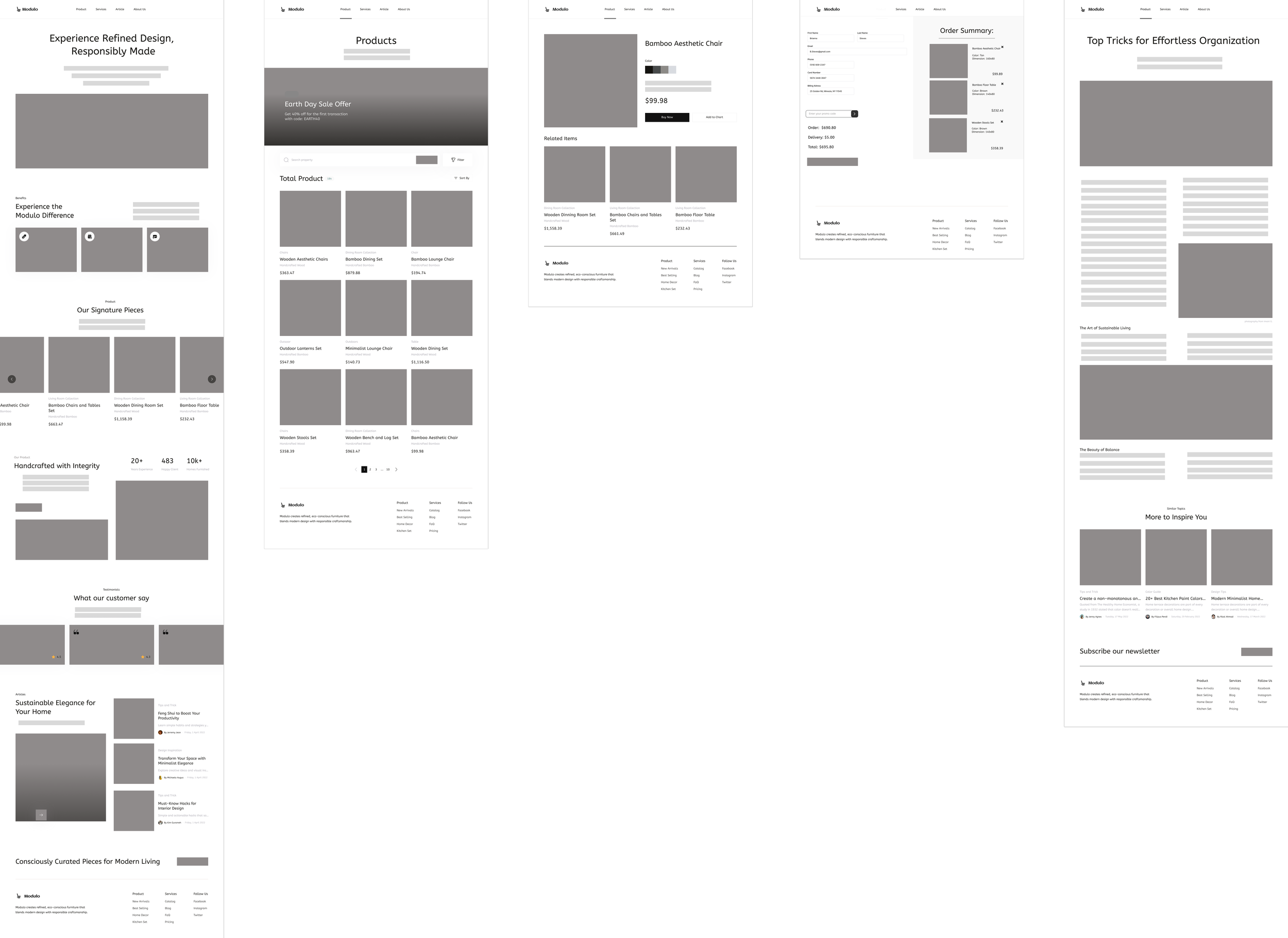
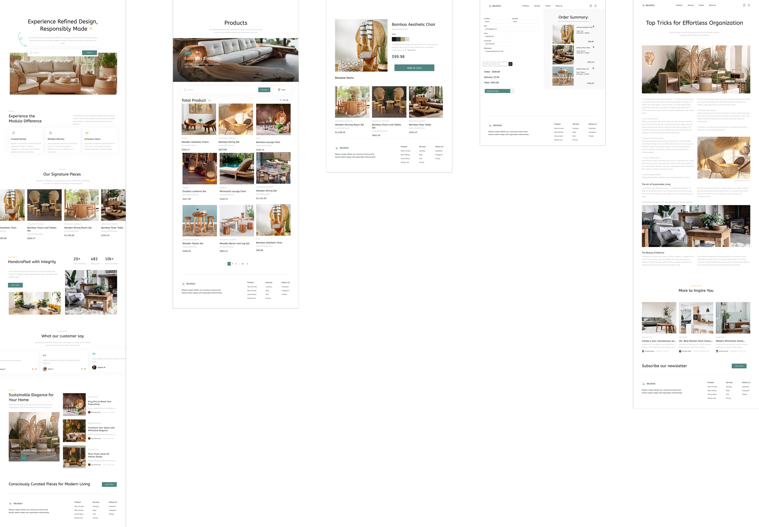
I mapped the user journey for Maya (our main persona) from awareness to retention and designed user flows for browsing, filtering, and completing purchases.
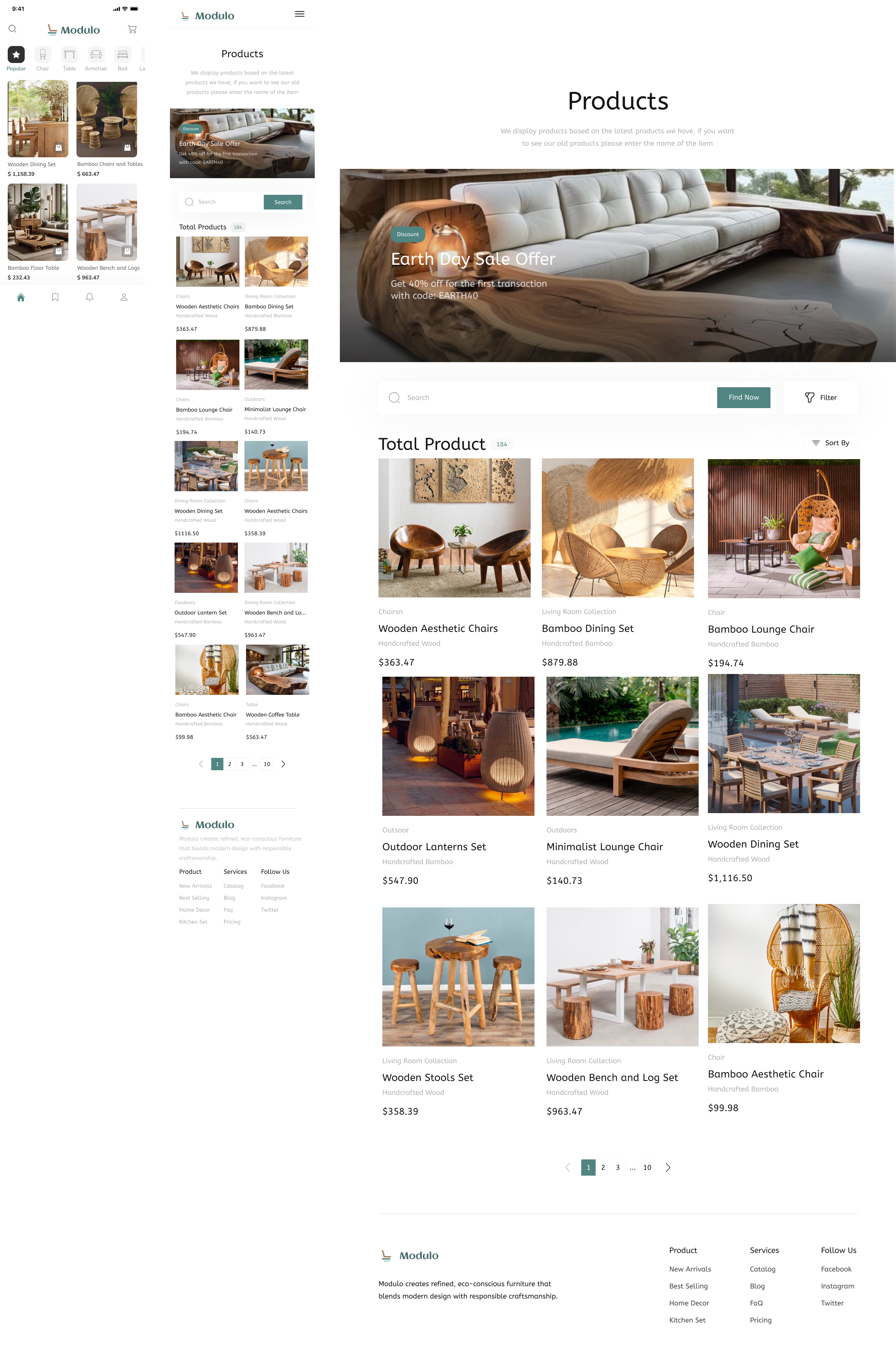
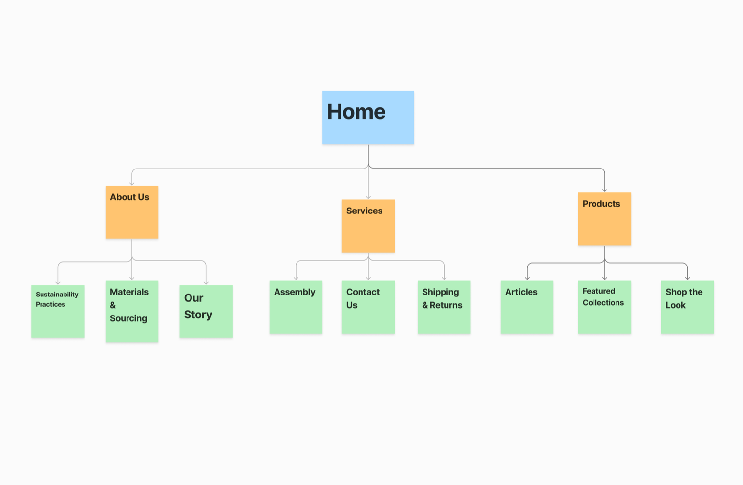
Navigation Simplification: Reduced main categories from six to four for clarity — Shop, Inspiration, About, Account.
Product Page Clarity: Added sustainability tags, delivery estimates, and user reviews up front to build trust.
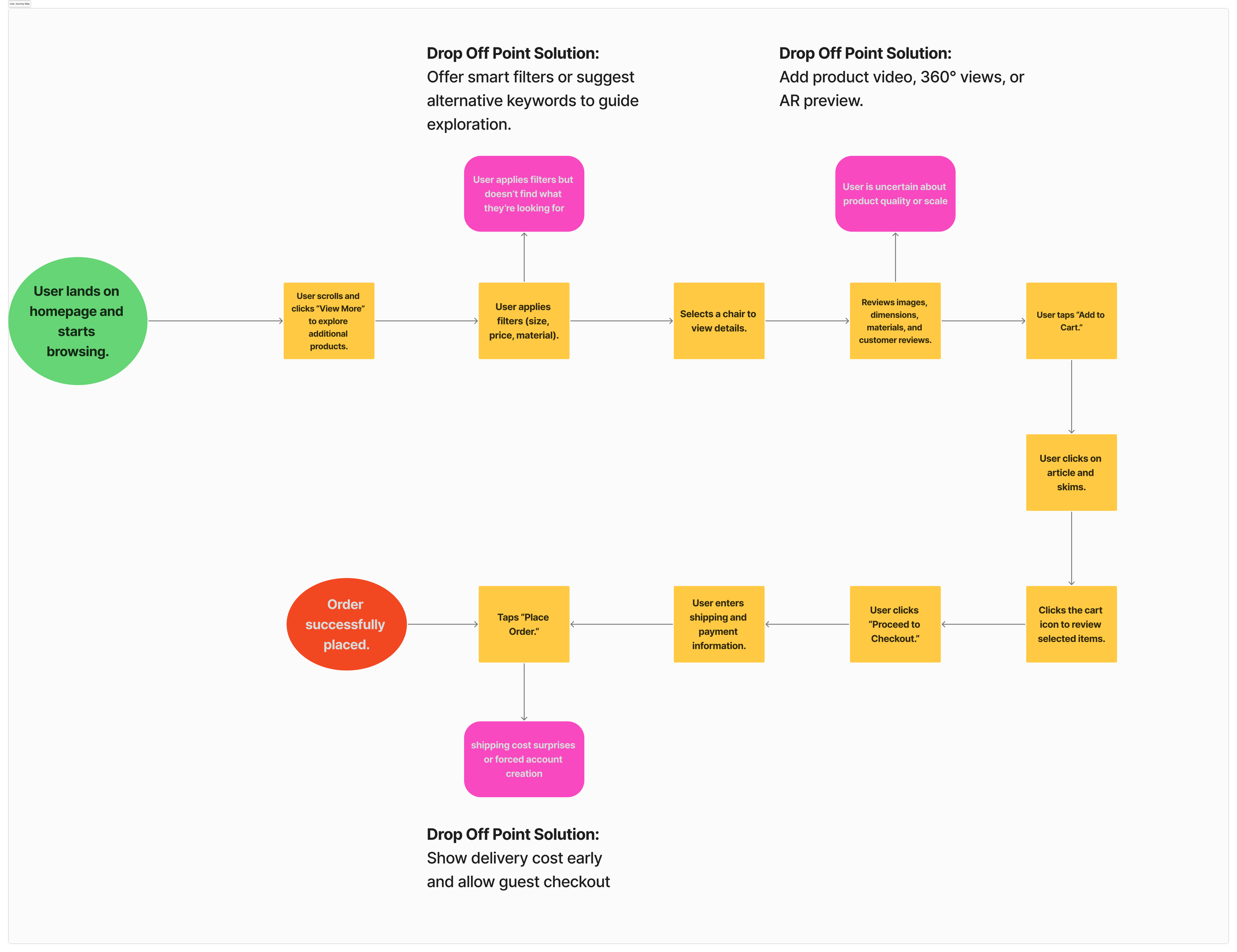
Checkout Flow: Created a clean, 3-step process (Cart → Info → Confirm) tested for mobile speed and clarity.
Visual Hierarchy: Used large imagery, calm spacing, and natural tones to reflect Modulo’s luxury and sustainable identity.
In usability testing (3 users on iOS lo-fi prototype):
Users easily completed the main purchase flow.
The filtering system was praised for clarity.
Improvements were made to cart visibility, delivery transparency, and confirmation navigation.
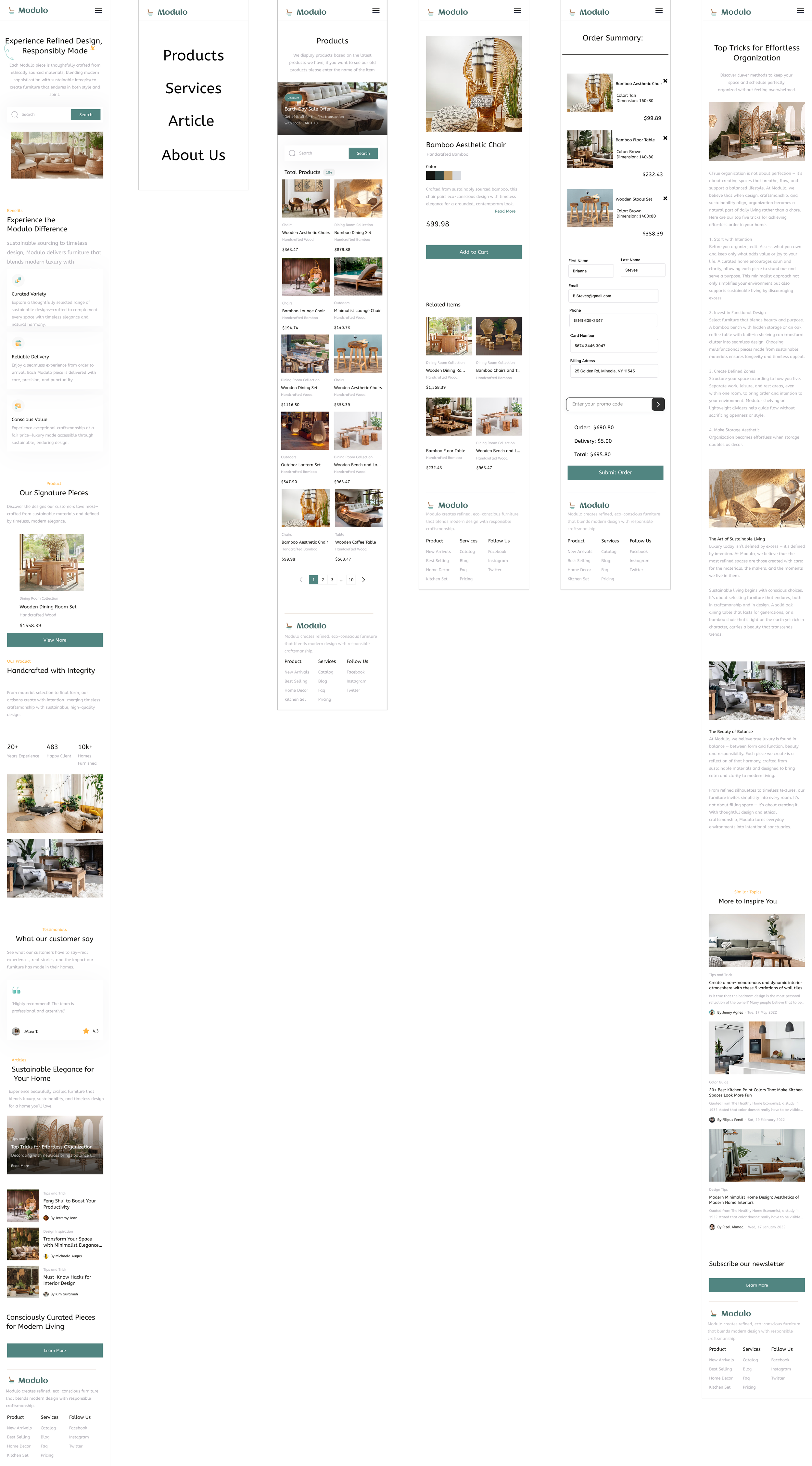
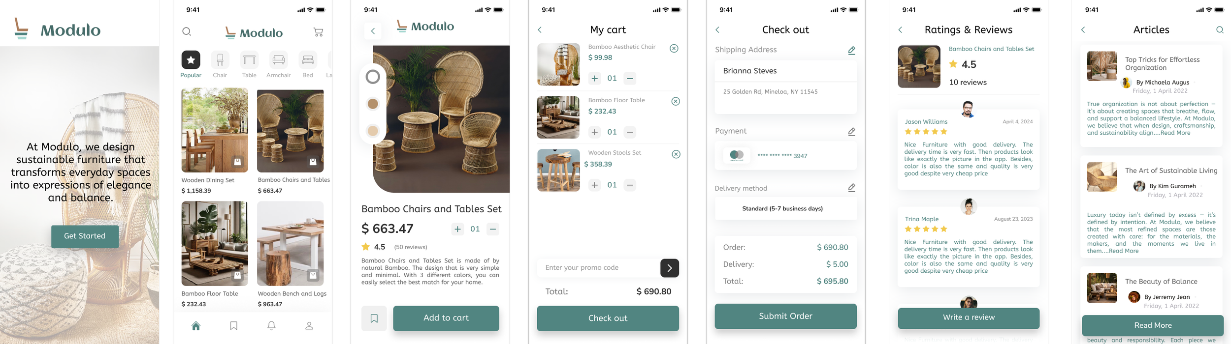
The Solution
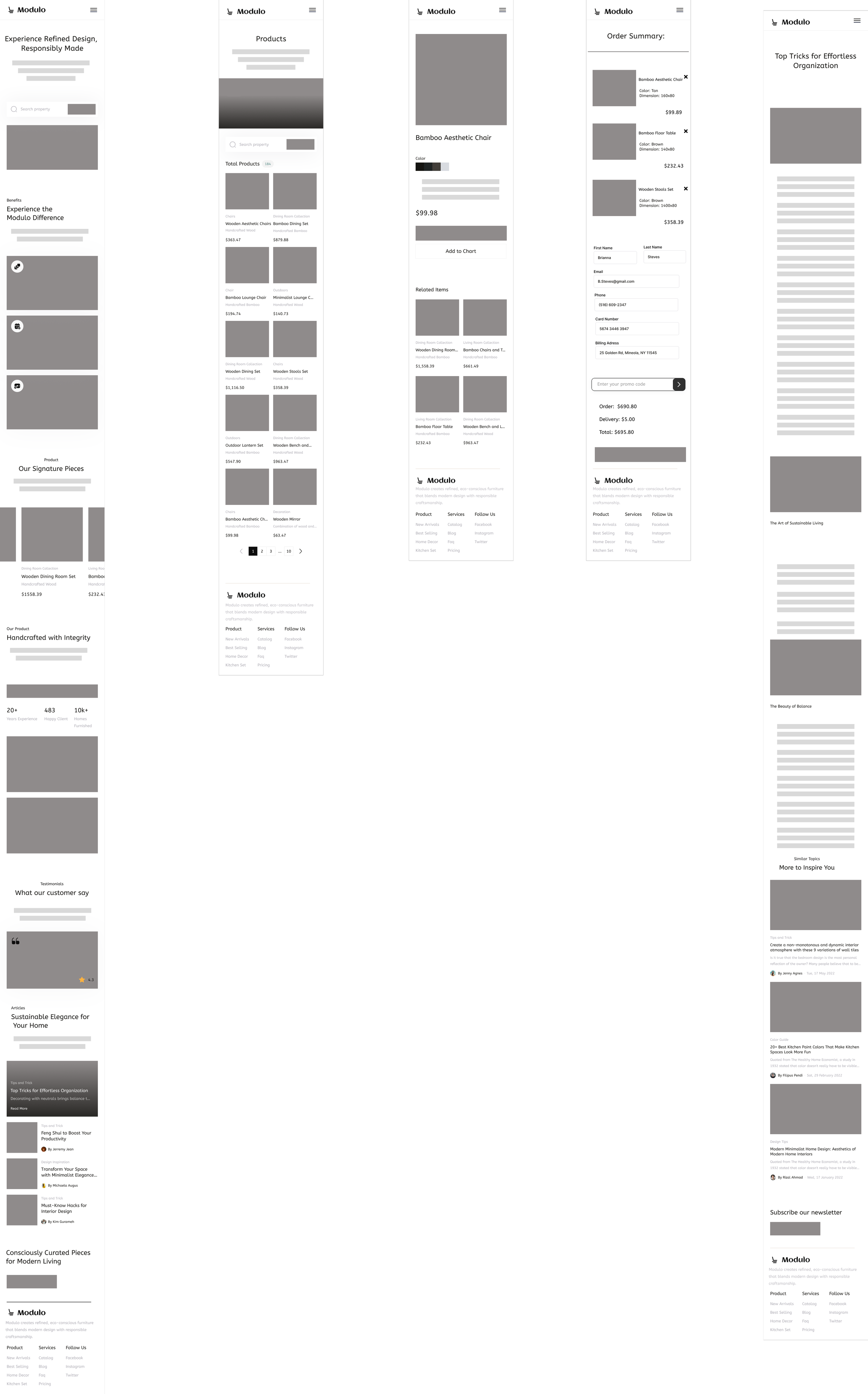
Modulo’s final design presents a calm, trustworthy, and elegant e-commerce experience that merges sustainability with luxury.
Key features include:
Curated collections for easy discovery
Transparent sustainability badges on product pages
Simplified checkout with early shipping visibility
Editorial “Inspiration” section linking design articles to product cards
Results
100% of test users completed the purchase flow successfully.
Users described the experience as “clean, simple, and high-end.”
The clear sustainability info increased user trust and interest in exploring the brand further.
What I Learned
This project taught me that sustainability doesn’t need to look rustic — it can feel refined and luxurious. It also reinforced the importance of testing early, simplifying navigation, and designing with both clarity and storytelling in mind.